
10 ListView / GridView layouts in Flutter
Lets look at 10 ListView / GridView layouts in Flutter
Rabikant
Mar 9, 2026
Flutter gives developers a rich toolbox for building smooth, scrollable layouts — and two of the most commonly used widgets for this are ListView and GridView. Whether you’re displaying text, photos, cards, menus, or product items, these widgets can handle a wide range of UI patterns.
In this guide, we’ll walk through 10 practical examples, each with sample code and an easytounderstand explanation.
1. Basic Vertical ListView
ListView(
  children: const [
    ListTile(title: Text("Item 1")),
    ListTile(title: Text("Item 2")),
    ListTile(title: Text("Item 3")),
  ],
)
Output
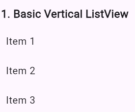
This is the simplest form of a ListView. Each item is written manually inside the children list, and Flutter stacks them vertically.
It’s perfect for short, static lists — like a small settings page or a fixed menu — because everything is predictable and easy to maintain. For long or dynamic lists, though, this approach quickly becomes impractical.
2. Horizontal ListView
ListView(
  scrollDirection: Axis.horizontal,
  children: [
    Container(width: 100, color: Colors.red),
    Container(width: 100, color: Colors.green),
    Container(width: 100, color: Colors.blue),
  ],
)
Output
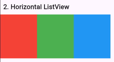
By simply setting scrollDirection: Axis.horizontal, you turn the list into a lefttoright scrolling layout.
Horizontal lists appear everywhere in modern apps — think Netflix rows, Instagram stories, or category strips in shopping apps. They’re great for thumbnails, quick actions, or compact card layouts.
3. ListView.builder
ListView.builder(
  itemCount: 5,
  itemBuilder: (context, index) =>
      ListTile(title: Text("Dynamic Item $index")),
)
Output
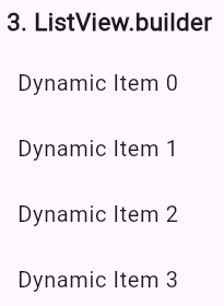
ListView.builder shines when you need performance. Instead of creating every item at once, it only builds what the user can currently see.
Use it when:
Your items come from an API
The list is long or unpredictable
You want smooth scrolling even with thousands of elements
Most realworld listbased UIs — like chats, feeds, or catalogs — rely on this builder pattern.
4. ListView.separated
ListView.separated(
  itemCount: 5,
  separatorBuilder: (context, index) => const Divider(),
  itemBuilder: (context, index) =>
      ListTile(title: Text("Separated Item $index")),
)
Output
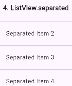
This version lets you insert a widget (often a Divider) between list items. It’s a simple way to make lists feel cleaner and easier to navigate.
You may use this layout for things like:
Settings screens
Message history
Product lists
Categorized data displays
Dividers help create clear visual structure without extra work.
5. GridView.count
GridView.count(
  crossAxisCount: 2,
  children: List.generate(4, (index) {
    return Card(child: Center(child: Text("Grid $index")));
  }),
)
Output
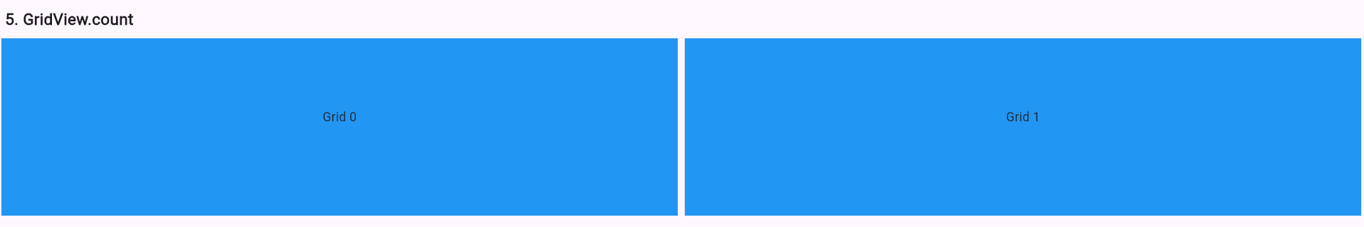
GridView.count is the easiest way to create a fixedcolumn grid — just tell Flutter how many columns you want.
It works especially well for:
Feature dashboards
Menu grids
Category tiles
Compact app shortcuts
When the layout is small or fairly static, this widget keeps things simple and predictable.
6. GridView.builder
GridView.builder(
  gridDelegate: const SliverGridDelegateWithFixedCrossAxisCount(
    crossAxisCount: 3,
    crossAxisSpacing: 10,
    mainAxisSpacing: 10,
  ),
  itemCount: 6,
  itemBuilder: (context, index) {
    return Container(
      color: Colors.teal[(index % 8 + 1)  100],
      child: Center(child: Text("Item $index")),
    );
  },
)
Output
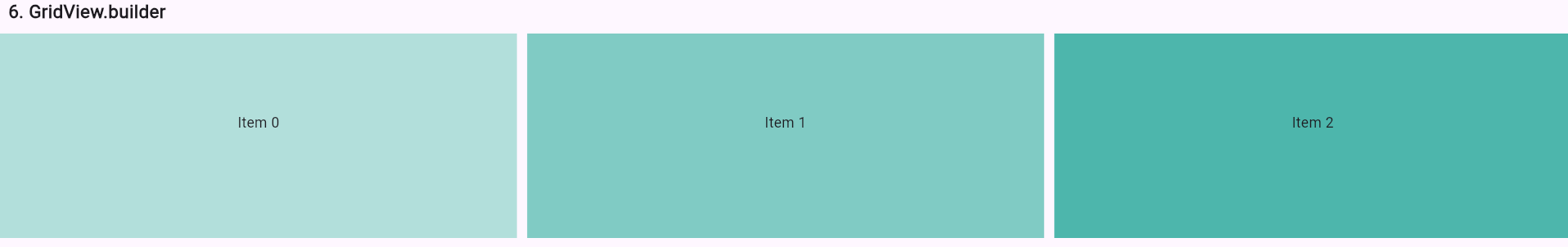
This is the grid equivalent of ListView.builder. Items are created lazily and only when needed, making it great for large collections like:
Product grids
Photo or wallpaper galleries
Search results
Category pages
The SliverGridDelegate lets you control spacing, column count, and layout behavior, making the grid flexible and performancefriendly.
7. GridView.extent
GridView.extent(
  maxCrossAxisExtent: 120,
  children: List.generate(6, (index) {
    return Container(
      margin: const EdgeInsets.all(8),
      color: Colors.orange,
      child: Center(child: Text("Tile $index")),
    );
  }),
)
Output
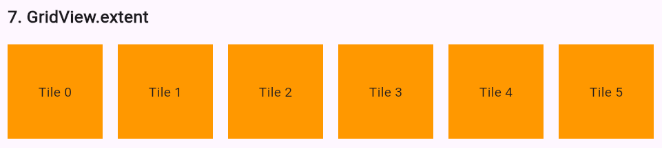
GridView.extent gives you responsive sizing: instead of defining how many columns you want, you define the maximum width of each tile, and Flutter calculates the rest.
It’s a great choice for:
Responsive dashboards
Tabletfriendly layouts
Dynamic galleries
Whenever tile size matters more than tile count, this is the widget to reach for.
8. ListView with Cards
ListView.builder(
  itemCount: 3,
  itemBuilder: (context, index) {
    return Card(
      margin: const EdgeInsets.all(8),
      child: ListTile(
        leading: const Icon(Icons.store),
        title: Text("Store $index"),
        subtitle: Text("Details about store $index"),
      ),
    );
  },
)
Output
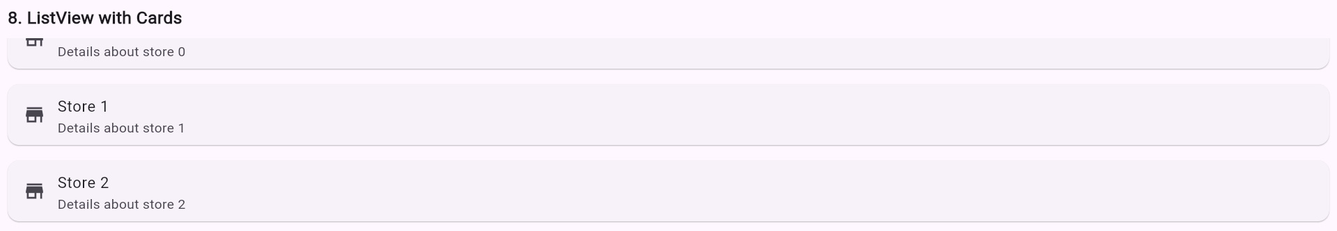
Wrapping list items inside Card widgets gives your UI a clean, modern feel. Cards add elevation, rounded edges, and spacing — separating each item visually.
This pattern works well for:
Shop or restaurant lists
Feature menus
Delivery app categories
Social media post previews
It’s a simple way to add polish without complicating your layout.
9. GridView with Network Images
GridView.count(
  crossAxisCount: 2,
  children: List.generate(4, (index) {
    return Image.network(
      "https://picsum.photos/200?random=$index",
      fit: BoxFit.cover,
    );
  }),
)
Output
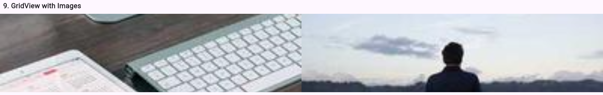
Displaying images in a grid is easy with GridView.count. This example pulls random photos from the network and arranges them neatly into two columns.
Common uses include:
Photo galleries
Product images
Portfolios
Thumbnail displays
BoxFit.cover ensures each photo fills the tile without distorting its aspect ratio.
10. ListView with ExpansionTiles
SizedBox(
            height: 300,
            child: ListView(
              children: [
                ExpansionTile(
                  leading: const Icon(Icons.store),
                  title: const Text("Store 1"),
                  children: const [
                    ListTile(title: Text("Address: Jamalpur, Bihar")),
                    ListTile(title: Text("Products: 120")),
                  ],
                ),
                ExpansionTile(
                  leading: const Icon(Icons.store),
                  title: const Text("Store 2"),
                  children: const [
                    ListTile(title: Text("Address: Patna, Bihar")),
                    ListTile(title: Text("Products: 85")),
                  ],
                ),
                ExpansionTile(
                  leading: const Icon(Icons.store),
                  title: const Text("Store 3"),
                  children: const [
                    ListTile(title: Text("Address: Ranchi, Jharkhand")),
                    ListTile(title: Text("Products: 60")),
                  ],
                ),
              ],
            ),
          ),SizedBox(
            height: 300,
            child: ListView(
              children: [
                ExpansionTile(
                  leading: const Icon(Icons.store),
                  title: const Text("Store 1"),
                  children: const [
                    ListTile(title: Text("Address: Jamalpur, Bihar")),
                    ListTile(title: Text("Products: 120")),
                  ],
                ),
                ExpansionTile(
                  leading: const Icon(Icons.store),
                  title: const Text("Store 2"),
                  children: const [
                    ListTile(title: Text("Address: Patna, Bihar")),
                    ListTile(title: Text("Products: 85")),
                  ],
                ),
                ExpansionTile(
                  leading: const Icon(Icons.store),
                  title: const Text("Store 3"),
                  children: const [
                    ListTile(title: Text("Address: Ranchi, Jharkhand")),
                    ListTile(title: Text("Products: 60")),
                  ],
                ),
              ],
            ),
          ),
Output
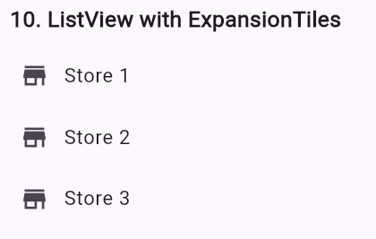
This code creates a scrollable ListView containing three ExpansionTiles. Each tile shows a store name with an icon, and expands to reveal extra details like address and product count. The SizedBox limits height, ensuring the list fits neatly. It’s useful for collapsible, organized data presentation in Flutter apps.
Tap gestures
Hero animations
Caching
Loading indicators
Offline images
Flutter makes grids both simple and highly customizable.
Complete Code
The project is available on our GitHub : https://github.com/Rabican-code/Flutter_grids