Rabikant
Nov 19, 2024
10 Button examples with Flutter
Let's make 10 Button examples with Flutter
Introduction to Flutter
Flutter is an open-source developer interface that allows for the creation of natively compiled applications for mobile, web, and desktop platforms and was developed by Google. . Flutter has gained love from the developers since this framework allows them to design applications with aesthetic and powerful user interface that is natively compiled and optimized for the performance. The major strength of Flutter is the use of the “widget” system. In Flutter everything is a widget, be it a button, text, layout, or even the whole application itself. Widgets are flexible in the sense that anyone can arrange, merge and integrate them and this leads to development of enhanced multiple layers of GUI.
One of the most significant and unseen features of Flutter is the Dart programming language that underpins the system. Scarce is the way to learning and provides quite a momentum to developers coming from Java, JavaScript, or C# background, for instance.
Setting Up Flutter
To develop a flutter application to deploy, first, the Flutter needs to be installed. Here's how you can do it:
- Install Flutter by downloading the SDK from the official Flutter website. Now, you will need to add Flutter to the system path. – To code, download an appropriate integrated development environment such as Visual Studio Code Flutter and Dart extension or Android Studio Flutter plugin.
Once your environment is set up, you can create a new Flutter project using the following command:
flutter create my_simple_app
Creating The Buttons
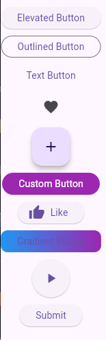
Basic Elevated Button
ElevatedButton(
            onPressed: () {
              print('Elevated Button Pressed');
            },
            child: Text('Elevated Button'),
          ),
Output
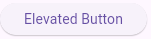
The onPressed callback is mandatory; as it determines what should happen anytime the user presses the button. In this case, the button coordinates print the string “Button Pressed” to the stdout.
Use Case: The ElevatedButton is used for actions that deserve notice and these include a “Submit” or “Proceed” button in forms or dialog boxes.
Outlined Button
OutlinedButton(
            onPressed: () {},
            child: Text('Outlined Button'),
          )
Output
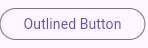
The OutlinedButton does not stand out as much as the ElevatedButton does. It has a border around the button but no background coloration, which makes it look a little cleaner.
Location and use When implemented, the button is frequently used when the action is less obvious in the user interface. Because it does not filled the background, it is suitable for actions that is not needed to be stressed out too much.
Use Case: For the actions that are not the primary focus of the page but areauxiliary, it is recommended to use OutlinedButton, for example, “Cancel,” “View More,” etc.
Text Button
TextButton(
            onPressed: () {},
            child: Text('Text Button'),
          )
Output
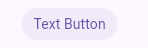
The TextButton is a flat button that has no frame around the text and does not contain background color. This button is related to the second type that uses only text but with the least possible images. This type is appropriate in cases where a button’s functionality corresponds to inlined or secondary actions from the vision and interaction are critical, but they are not highlighted and do not attract central attention.
**Use Case:**TextButton can be used for actions like “Skip”, “Learn More” or any other situation where a small UI element will suffice along with the size not making a false impact in the layout.
Icon Button
  IconButton(
            icon: Icon(Icons.favorite),
            onPressed: () {
              print('Icon Button Pressed');
            },
          )
Output

The IconButton component is used when the button purpose can be described only by the icon and does not require the label. In this example it shows the button in the form of a heart and it gives this message in the console when pressed.
**Use Case:**IconButton should be used in such cases as Favorite, Like, or Share buttons. As they do not have a label, there is a risk that the icon may not be recognized or its meaning may not be quite clear enough.
Floating Action Button
    FloatingActionButton(
            onPressed: () {},
            child: Icon(Icons.add),
          )
Output
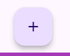
The FAB is also known as MFAB, which stands for Material Fundo Circular button; FAB is a circular button that is mostly used to perform primary actions in an app. Often it is located above the main content and raised to stand out from the rest of the page. FAB is normally applied for the fundamental operation on the screen, for instance, to create a new item, to introduce a new contact, or to launch a new dialogue.
Use Case: The FloatingActionButton is used when the required action must be easily distinguishable and within easy reach, for example, “Create,” “Add,” “Compose.”
Custom Styled Button
          ElevatedButton(
            style: ElevatedButton.styleFrom(
              backgroundColor: Colors.purple, // background color
              foregroundColor: Colors.white, // text color
              shape: RoundedRectangleBorder(
                borderRadius: BorderRadius.circular(20),
              ),
            ),
            onPressed: () {},
            child: Text('Custom Button'),
          )
Output
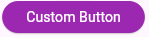
The ElevatedButton component comes in different designs to fit the Ui design language of your application. In this case, the button has a purple color for the background and white color for the text and has rounded corners for a gentler look.
With the help of ElevatedButton.styleFrom, one can change the button properties like the background color primary, the text color onPrimary, and the shape of the button (which in this case is a RoundedRectangleBorder with certain corner shapes).
Use Case: Custom buttons are helpful when the pre-programmed button styles do not meld well with the design of the application. This may be for brand imaging, or to give a certain feel to the user interface or just to include more character in the design.
Icon with Text Button (Elevated)
         ElevatedButton.icon(
            onPressed: () {},
            icon: Icon(Icons.thumb_up),
            label: Text('Like'),
          )
Output
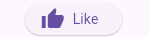
In some occasions, one might require to have both an icon and a label on the button to enhance on their function. Here, instead of text only the button demonstrates a “thumbs up’ symbol besides the words ‘Like.’ There is the ElevatedButton.icon which is a constructor that allows the addition of an icon and text in the button.
Use Case:
This type of button is valuable for actions where visual and textual prompts appear to be beneficial. For instance, possible features of buttons where type and icon are used for a specific action might be labeled as “Like,” “Share,” or “Subscribe.”
Gradient Background Button
Container(
            decoration: BoxDecoration(
              gradient: LinearGradient(
                colors: [Colors.blue, Colors.purple],
              ),
              borderRadius: BorderRadius.circular(10),
            ),
            child: ElevatedButton(
              style: ElevatedButton.styleFrom(
                backgroundColor: Colors.transparent,
                shadowColor: Colors.transparent,
              ),
              onPressed: () {},
              child: Text('Gradient Button'),
            ),
          )
Output
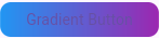
In case you need a deeper level of customization, you can wrap the ElevatedButton inside Container which will allow applying styles like gradient. In this case, the background of the button is a blue to purple gradient while the button form itself is rendered completely transparent to show off the gradient.
Use Case: Gradient buttons can be applied when the design aspect of the project matters most. It could be for branding or for specific design themes when creating promotion pages, splash pages, or call-to-action buttons.
Circular Icon Button
  ElevatedButton(
            style: ElevatedButton.styleFrom(
              shape: CircleBorder(),
              padding: EdgeInsets.all(24),
            ),
            onPressed: () {},
            child: Icon(Icons.play_arrow),
          )
Output

It is recommended that a circular button can be applied to create a sense of differentiation of buttons that pertain to media control such as playing, pausing or recording. If you set the value of shape property of the button to CircleBorder, a round button with no angles at the corners can be produced. In this example, the button doesn’t actually have any text, instead, what is displayed is a play icon.
Use Case: Circular buttons are normally applied for media buttons (play, pause, etc) or for the floating action buttons if the size is small. They offer an elegant and space-saving shape which is an alternative to rectangular shapes of traditional push-buttons.
Button with Loading Spinner
bool isLoading = false;

 ElevatedButton(
            onPressed: isLoading ? null : () {
              setState(() {
                isLoading = true;
              });
              // Simulate a delay
              Future.delayed(Duration(seconds: 2), () {
                setState(() {
                  isLoading = false;
                });
              });
            },
            child: isLoading
              ? CircularProgressIndicator(
                  valueColor: AlwaysStoppedAnimation<Color>(Colors.white),
                )
              : Text('Submit'),
          )
Output
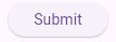
If an action of an application is going to take a while, for example sending a form, or making a network request, you may need to inform a user that something is happening. This example will demonstrate how to add a loading spinner to a button. The button is disabled when loading is true to ensure the user cannot click the button severally thus executing the same command repeatedly.
Use Case: This type of button is useful for any action that requires some time to be processed, like submitting forms, making network requests or loading data. It gives feedback to the user, specifically on the fact that the user cannot submit the form more than once and the quality of the user experience is therefore boosted.
This is our lib/main.dart file:
import 'package:flutter/material.dart';

void main() {
  runApp(MyApp());
}

class MyApp extends StatelessWidget {
  @override
  Widget build(BuildContext context) {
    return MaterialApp(
      title: 'Button Examples',
      home: Scaffold(
        appBar: AppBar(
          title: Text('Button Examples'),
        ),
        body: ButtonExamples(),
      ),
    );
  }
}

class ButtonExamples extends StatefulWidget {
  @override
  _ButtonExamplesState createState() => _ButtonExamplesState();
}

class _ButtonExamplesState extends State<ButtonExamples> {
  bool isLoading = false;
  @override
  Widget build(BuildContext context) {
    return SingleChildScrollView(
      child: Column(
        mainAxisAlignment: MainAxisAlignment.center,
        children: [
          // 1. Basic Elevated Button
          ElevatedButton(
            onPressed: () {
              print('Elevated Button Pressed');
            },
            child: Text('Elevated Button'),
          ),
          SizedBox(height: 10),

          // 2. Outlined Button
          OutlinedButton(
            onPressed: () {},
            child: Text('Outlined Button'),
          ),
          SizedBox(height: 10),

          // 3. Text Button
          TextButton(
            onPressed: () {},
            child: Text('Text Button'),
          ),
          SizedBox(height: 10),

          // 4. Icon Button
          IconButton(
            icon: Icon(Icons.favorite),
            onPressed: () {
              print('Icon Button Pressed');
            },
          ),
          SizedBox(height: 10),

          // 5. Floating Action Button
          FloatingActionButton(
            onPressed: () {},
            child: Icon(Icons.add),
          ),
          SizedBox(height: 10),

          // 6. Custom Styled Button
          ElevatedButton(
            style: ElevatedButton.styleFrom(
              backgroundColor: Colors.purple, // background color
              foregroundColor: Colors.white, // text color
              shape: RoundedRectangleBorder(
                borderRadius: BorderRadius.circular(20),
              ),
            ),
            onPressed: () {},
            child: Text('Custom Button'),
          ),
          SizedBox(height: 10),

          // 7. Icon with Text Button (Elevated)
          ElevatedButton.icon(
            onPressed: () {},
            icon: Icon(Icons.thumb_up),
            label: Text('Like'),
          ),
          SizedBox(height: 10),

          // 8. Gradient Background Button
          Container(
            decoration: BoxDecoration(
              gradient: LinearGradient(
                colors: [Colors.blue, Colors.purple],
              ),
              borderRadius: BorderRadius.circular(10),
            ),
            child: ElevatedButton(
              style: ElevatedButton.styleFrom(
                backgroundColor: Colors.transparent,
                shadowColor: Colors.transparent,
              ),
              onPressed: () {},
              child: Text('Gradient Button'),
            ),
          ),
          SizedBox(height: 10),

          // 9. Circular Icon Button
          ElevatedButton(
            style: ElevatedButton.styleFrom(
              shape: CircleBorder(),
              padding: EdgeInsets.all(24),
            ),
            onPressed: () {},
            child: Icon(Icons.play_arrow),
          ),
          SizedBox(height: 10),

          // 10. Button with Loading Spinner
          ElevatedButton(
            onPressed: isLoading ? null : () {
              setState(() {
                isLoading = true;
              });
              // Simulate a delay
              Future.delayed(Duration(seconds: 2), () {
                setState(() {
                  isLoading = false;
                });
              });
            },
            child: isLoading
              ? CircularProgressIndicator(
                  valueColor: AlwaysStoppedAnimation<Color>(Colors.white),
                )
              : Text('Submit'),
          ),
        ],
      ),
    );
  }
}
Running the App
To run the app, use the following command in your terminal:
flutter run
This will build and run the app on an emulator or a device that is linked to the application. You should see one screen that contains the app bar and the words ‘Hello, World!’ displayed in the center.
One of the most important aspects of Flutter is hot reload that allows to see a new code immediately without restarting the application. This makes the development process faster and economic.
Conclusion Flutter has a rich source of buttons created to fit various requirements, offering not only the basic ElevatedButton and TextButton but gradient backgrounds and icon combinations as well. This means that developers can make buttons that not only work in a certain manner but also fit the whole look and feel of the application.
Knowledge of when and how to apply the various button types is fundamental in designing natural and captivating user interfaces. Different types of buttons in Flutter when used with appropriate customizations will help developers achieve the desired appearance of functional UI.
Complete Code
The project is available on our GitHub : https://github.com/piehostHQ/flutter-buttons